
Hello friends!
I know for sure that all quilters are addicted to colors! And some are addicted to rainbow, right?
With fabric and thread available in so many colors, don’t you find overwhelming when it is time to make an order? When you can choose thread from 100 colors or fabric from 300 colors, how do you know that you order the exact colors you need?
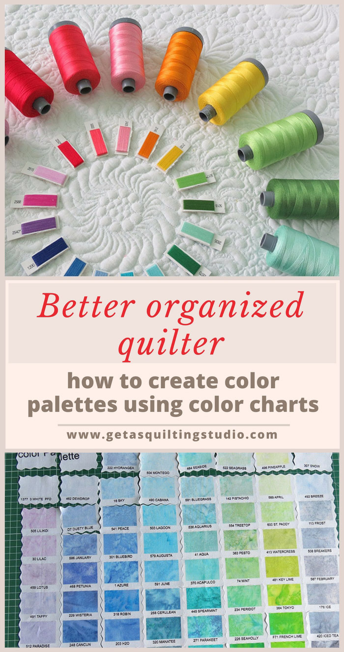
A few years ago I bought a rainbow collection of Aurifil 12wt and now I wanted to try the 28wt thread (thinner than 12wt and just fabulous- I think the best weight to use for wholecloth quilts, more about it soon!). Choosing the exact colors you want from an online shop is time-consuming and only when you have the thread in your hand you can say if the colors are matching together the way you wanted or if they offer the contrast you wanted.

That’s why I find a color card such a convenient tool!
I wanted a rainbow of colors and for each color I wanted two tones: dark and light. That’s why I cut my Aurifil card into individual pieces, for easy color matching.
First, I cut the card into long strips (using scissors) then I cut each strip into individual pieces.
 This was my choice of colors.
 Then I did even more! When I received the thread, I put all the spools into a box, with the corresponding chips (keeping the remaining chips into another box). If I need more thread, this will help me not to order the same colors and it also makes creating new color palettes easier.

I find these steps important because I want to have a palette to use over and over again, especially on wholecloth quilts.

I wish to be this organized when it comes to my Kona cotton fabrics! I have a color card for these fabrics too, but I haven’t used it properly until now. I have three boxes of Kona cotton and I have no idea what colors I have. I have to order more fabric and I don’t have the patience to find out what I already have.
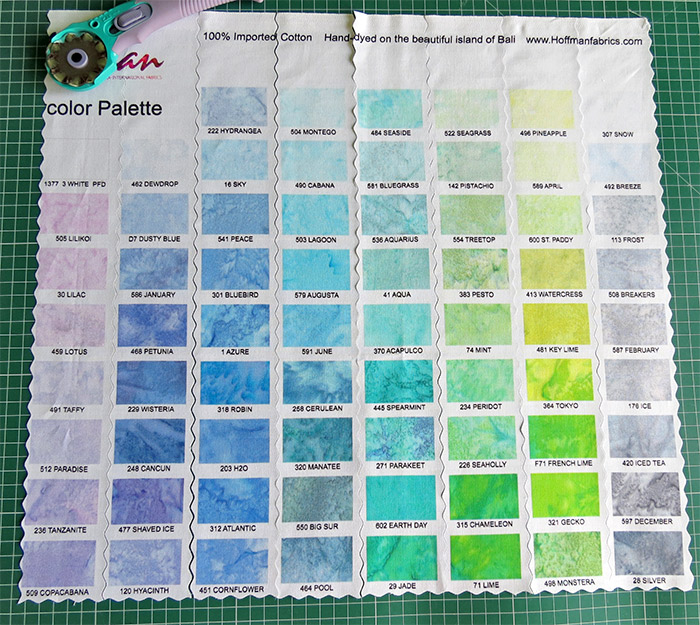
I also managed to lose many color chips, so I bought a color chart printed on fabric. If you want to just select your favorite colors, this digitally printed panel works great. If you want to create custom palettes, then it is easier to cut out the pieces.
 Many manufacturers have such color charts for their lines, this one below is for the Hoffman batiks.
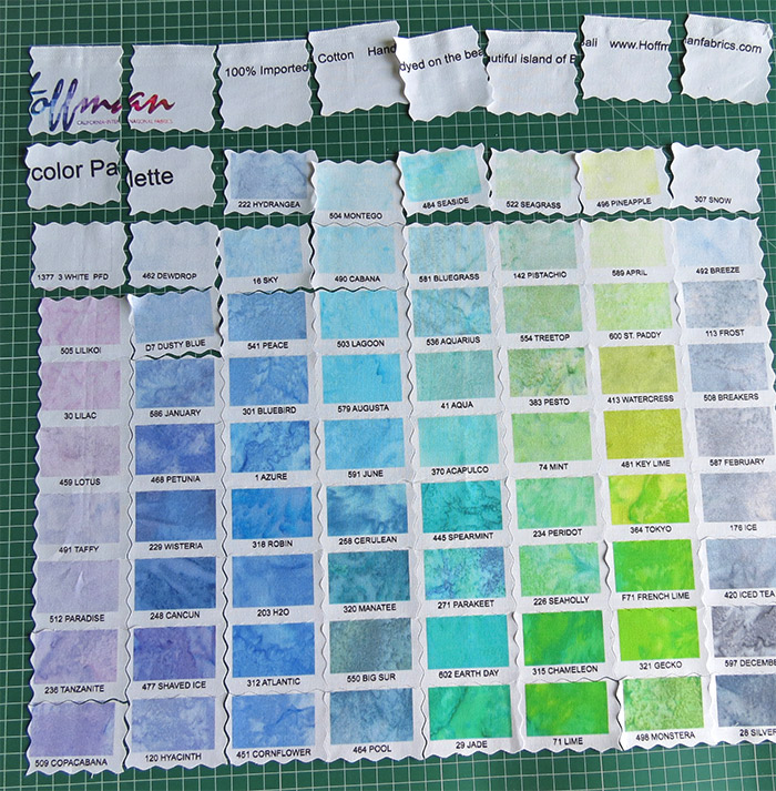
I want to create some gradation palettes and again, having the individual swatches makes this easier.

Very anxious, I started to cut the panel! I made mistakes, so I want you to learn from them!
Keeping so many little pieces in order is not an easy task. Playing with them it’s fun, but it requires a lot of time!
So here are some tips:
- If for the same line there are two options for the color chart: printed on fabric and swatches glued on cardstock, the cardstock version is easier to use! It is more expensive but in my opinion, it is worth the extra money.
- If you have the printed fabric panel, if you need to cut it, you should fuse on the back some kind of interfacing, before starting to cut it; this keeps the pieces more durable and easier to work with (at an added cost!).
- Here is how I cut my panel. Using a pinking blade helps to keep a minimal fraying.
4. One more thing I think helps: some colors are very similar, I plan to put aside some of these colors. Also, some colors are too light or too dark for my purpose, so I will remove them too. And there are many colors that I usually don’t use in my quilts so I will remove them too.
Basically, I remove the pieces that aren’t useful for my purpose, and only after that, I start organizing the remaining swatches- this makes the work more manageable!
I hope these tips help!
Have a productive sewing week!

Pin this for later!